Latitude Finance brought me into two significant digital initiatives — the 28° Travel Card and the Gem App launch — as a UX lead focused on transforming how customers first meet and understand these products.
Individually, each project centred on improving a single surface (a landing page, an eDM, a product introduction).
Together, they represent a deeper challenge common across financial products:
How do you tell a clear, trustworthy, and compelling story across web, mobile, email, and app — without overwhelming users, and while enabling internal teams to scale content over time?
These two projects demonstrate the type of work I enjoy most:
- Clarifying complex value propositions
- Designing modular content systems
- Aligning multiple teams around one shared narrative
- Developing experiences that feel effortless, even when what sits beneath them is not
- Understanding the Space
Financial products are often abstract, heavily regulated, and difficult to communicate simply.
Whether someone is evaluating a travel card or a new finance app, the real competition is not another provider — it’s lack of clarity and decision fatigue.
Across both projects, my goal was to create experiences that:
- Give users a clear sense of what the product does
- Match content to their intent and level of knowledge
- Work consistently across surfaces
- Reduce friction, not add to it
- Allow for future content growth
- Create intuitive pathways from “curious” to “ready to apply/install”
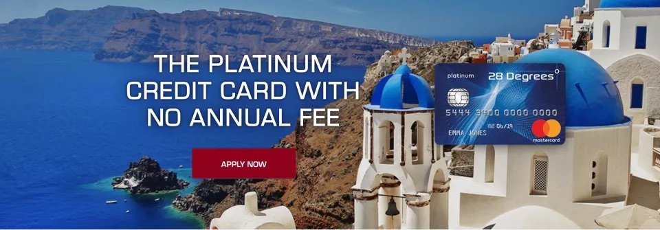
Case 1 — 28° Travel Card:
From Static Page to Adaptive Content System
Challenge
The original 28° Travel Card landing page was serviceable but static. It told a single linear story with no way for different types of travellers to discover what mattered most to them.
Performance data showed drop-offs in predictable places — sections that weren’t landing because they weren’t relevant to everyone.
The question was:
How do we make one page speak meaningfully to many different user scenarios, while staying simple?
Approach
1. Behavioural and performance analysis
I reviewed heatmaps, scroll depth, behavioural flow, and click engagement to understand where the story succeeded and where friction sat.
2. Competitive landscape scan
I mapped how leading travel/credit card providers articulate benefits, manage complexity, and use interaction to lift comprehension.
3. Modular content strategy
Instead of a fixed narrative, I designed a system based on “travel modes” — distinct user scenarios such as holiday planning, business travel, online shopping overseas, and everyday use.
Each mode contained:
- Tailored examples
- Situation-specific benefits
- Appropriate CTAs
- Relevant micro-stories
4. Interaction design
Originally a dropdown, the structure evolved into clearer tabs — maintainable, predictable, and friendly for authors and users alike.


Outcome
- A landing page that feels personalised without needing personal data
- Modular content blocks that Latitude’s team can reuse across campaigns
- Higher clarity for decision-making
- A stronger narrative structure that meets travellers where they are, rather than asking them to adapt to the page

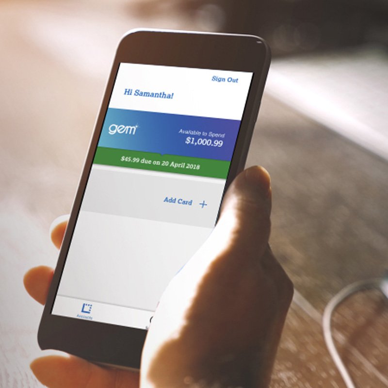
Case 2 — Gem App Launch:
A Unified Communication Pathway Across Email → Web → App
Challenge
The Gem App product team had a strong foundation — the core UX and features — but the introduction experience for new users needed the same clarity and coherence.
Users were being introduced to the app via eDM + landing page, and the journey between those surfaces needed to feel cohesive, intentional, and reassuring.
The key question:
How do you introduce a multi-feature finance app in a way that feels simple, trustworthy, and easy to adopt?
Approach
1. Cross-team alignment
I partnered with Latitude’s internal UX team to identify the MVP feature set and map how those features should be communicated externally.
2. Reviewing the product UX
I explored the app’s flows across mobile and desktop to understand the underlying product logic and how to translate it faithfully into marketing UX.
3. Designing a two-step communication funnel
The introduction became a simple, two-touch sequence:
Step 1 — The eDM
- Clear introduction
- Context for the test market (NZ)
- High-level benefits
- CTA to install
- CTA to learn more
Step 2 — The Landing Page
- Re-establishes trust and consistency
- Visual alignment with the app
- Animated UI moments (GIFs) for comprehension
- Clear feature breakdown
- FAQ section to eliminate confusion and friction


Outcome
- A communication journey that feels coherent and reassuring
- Messaging that aligns with the product’s actual UX
- Motion-based UI previews that raise understanding without overwhelming
- A repeatable framework for future product rollouts and feature updates
Design Leadership Across Both Projects
Across both the 28° and Gem App initiatives, I operated as a UX lead bridging product, marketing, content, and internal design teams.
The work required:
- Systems Thinking
Not just designing pages — designing content systems, decision pathways, and frameworks that Latitude could reuse long after delivery. - Cross-functional Collaboration
Working with product managers, marketing leads, internal UX, and content authors to align on what story we wanted to tell — and how users would experience it across channels. - Complexity Simplification
Converting financial concepts into clear, accessible user value propositions that support confidence and action. - Multi-surface UX
Ensuring consistency between eDM, landing page, mobile web, app previews, and content ecosystems. - Scalability
Creating structures that could grow as products and regions evolve.
Why These Projects Matter as a Body of Work
Together, these two initiatives show a pattern of work that aligns well with complex digital finance ecosystems:
- Designing entry points into multi-feature financial products
- Aligning marketing layers with product UX
- Turning static content into modular systems
- Balancing clarity, depth, and flexibility
- Leading UX through ambiguous, multi-stakeholder environments
- Maintaining coherence across web, mobile, and app touchpoints
- Advocating for user needs in the earliest phases of product adoption
This case study represents the type of work I enjoy most — solving complexity with clarity, building structure around evolving products, and helping teams deliver simpler, more human experiences in spaces where trust matters.